Reading Time 3
Number of Words 626
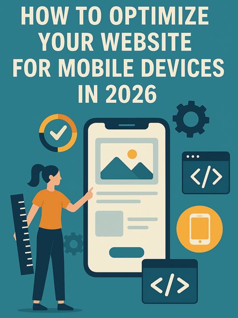
In 2026, optimizing a website for mobile is no longer a recommendation , it's a requirement.
More than 60% of global web traffic comes from mobile devices, and Google evaluates websites first in their mobile version before the desktop version.
If your website is not optimized for mobile, you not only lose users:
👉 you lose Google rankings, conversions, and business opportunities .
What Does Optimizing a Website for Mobile Really Mean?
Optimizing for mobile is not just about making it "look good on the phone".
It implies:
-
Fast loading speed on mobile networks
-
Real responsive design
-
Content readable without zooming
-
Clear finger navigation
-
Conversions designed for small screens
In short:
the mobile experience should be even better than the desktop experience .
Why Mobile Traffic Is Key in 2026
Before optimizing, you need to understand the context.
With real data:
Using Lookkle's Web Traffic Checker , you can see:
-
% of mobile traffic vs desktop
-
Historical trends in mobile usage
-
Dominant devices by country
-
Behavior by sector
Example:
A self-employed person analyzes their website with Lookkle and discovers:
-
72% of traffic is mobile
-
But the bounce rate is much higher on mobile.
Clear conclusion:
👉 The problem is not traffic, it's the mobile experience .
Step 1: Analyze Mobile Traffic with Lookkle
Before touching the design, analyze the data.
What to look for on Lookkle :
-
Traffic distribution by device
-
Evolution of mobile traffic over time
-
Comparison with competitors
-
Countries where mobile usage dominates
Case study:
A small e-commerce business discovers that:
-
In Spain, 65% is mobile.
-
In Latin America, it exceeds 80%.
👉 The website should prioritize mobile, not desktop.
Step 2: Optimize Speed for Mobile Users
Speed is the number one moving factor .
Key data:
-
More than 3 seconds of loading time = mass abandonment
-
Mobile users have less patience
-
Google penalizes slow websites on mobile
How to use Lookkle here:
-
Detects pages with the highest mobile traffic
-
Prioritize optimization only on those pages.
-
Analyze faster competitors
Specific actions:
-
Compress images
-
Use modern formats (WebP)
-
Reduce unnecessary scripts
-
Optimized hosting
👉 Don't optimize everything at once, start with what receives the most mobile traffic.
Step 3: Mobile-First Design (not “mobile friendly”)
In 2026, mobile-first is not an option .
Common mistake:
Design for desktop and "adapt" to mobile.
Correct approach:
Design with the following in mind first:
-
Small screens
-
One-handed use
-
Vertical scroll
-
Limited attention
With help from Lookkle:
-
Identify main pages
-
Restructures its design for mobile only
-
Remove unnecessary elements
Fewer things = more conversions.
Step 4: Optimize Content for Mobile Reading
Content is consumed differently on mobile.
Good practices:
-
Paragraphs of 2–3 lines
-
Clear subtitles (H2, H3)
-
Lists and visual blocks
-
Blank spaces
Example:
A landing page with long text on desktop
👉 becomes illegible on mobile
Solution:
-
Divide content
-
Prioritize key messages at the top
-
CTA visible without excessive scrolling
Step 5: Navigation and UX designed for fingers
A typical mistake:
Menus designed for mouse.
Real mobile optimization:
-
Large buttons
-
Simple menu
-
Easy Clicks
-
Short forms
Using Lookkle:
-
Analyze top pages
-
Check if they generate mobile traffic but not conversions
-
Adjust only those pages
Optimizing mobile UX directly impacts sales .
Step 6: Mobile Conversions (the great forgotten one)
Having mobile traffic is useless if it doesn't convert.
Key questions:
-
Is it easy to contact from a mobile phone?
-
Is the CTA visible?
-
Is the form usable?
Example:
A freelancer receives 10,000 mobile visits/month.
But:
-
Phone number not clickable
-
The form has 10 fields
Result:
❌ Zero leads
Optimization:
-
“Call now” button
-
WhatsApp integrated
-
3-field forms
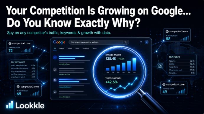
Step 7: Analyze Mobile-First Competitors with Lookkle
One of Lookkle's biggest advantages is analyzing the competition .
What to look for:
-
Who has more mobile traffic?
-
Which pages stand out
-
What structure do they use?
-
Which countries prioritize
👉 Copying what works (and improving it) is a smart strategy.
Step 8: Mobile SEO and Positioning
Google evaluates your website in mobile version .
Direct impacts:
-
Slow website = worse ranking
-
Bad UX = more bounce rate
-
Hidden content = less relevance
With Lookkle you can:
-
Detect pages with organic mobile traffic
-
Prioritize its optimization
-
Measure evolution after changes
Step 9: Prioritize with Data, Not Assumptions
One of the biggest mistakes is optimizing “everything”.
Correct strategy:
-
Analyze mobile traffic with Lookkle
-
Identify key pages
-
Optimize only those
-
Measure results
-
Repeat
Less effort, more impact.
Complete Realistic Example
Profile:
Self-employed with a services website.
Lookkle data:
-
70% mobile traffic
-
3 pages generate 80% of visits
Action:
-
Optimize only those 3 pages
-
Speed improvement
-
Simplify design
-
Adjust mobile CTA
Result:
✔ More leads
✔ Lower bounce rate
✔ Better SEO
Common Mistakes When Optimizing for Mobile
❌ Focusing solely on design
❌ Ignoring speed
❌ Long forms
❌ Dense content
❌ Not measuring results