Reading Time 14
Number of Words 3076
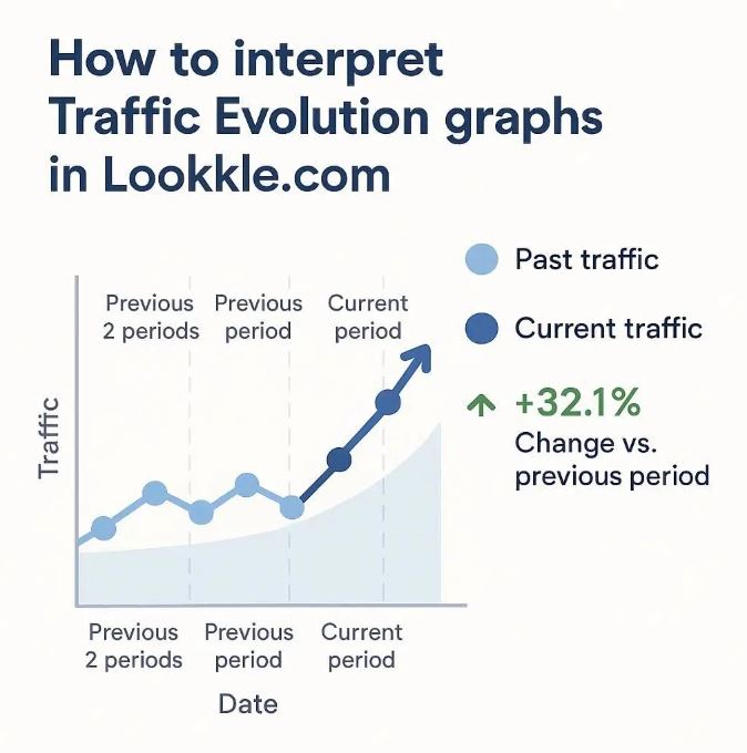
Understanding how to read and interpret traffic evolution graphs is a fundamental skill for anyone working in digital marketing, SEO, or web analytics. Raw numbers tell you what happened, but graphs reveal the story behind those numbers. They show you patterns, trends, anomalies, and opportunities that might otherwise remain hidden in spreadsheets.
In this chapter, you'll learn how to analyze traffic graphs effectively using Lookkle's Web Traffic History tool. We'll explore growth curves, seasonal drops, behavioral patterns, and how to extract actionable insights from visual data.
Understanding the Basics of Traffic Graphs
The Anatomy of a Traffic Graph
Before diving into interpretation, let's understand what you're looking at when you view a traffic evolution graph in Lookkle.
The X-Axis (Horizontal): Represents time periods, typically displayed in months or weeks. This shows the chronological progression of your data.
The Y-Axis (Vertical): Represents traffic volume, usually measured in visits, sessions, or unique visitors. The scale adjusts automatically based on your traffic levels.
The Line or Curve: Shows the actual traffic progression over time. The shape of this line tells the story of your website's performance.
Data Points: Individual markers on the line representing specific time periods. Hovering over these reveals exact numbers.

Reading Traffic Volume
The first step in graph interpretation is understanding the scale. A website receiving 1,000 visits per month has a very different context than one receiving 1 million. Always check the Y-axis scale before making judgments about growth or decline.
Relative vs. Absolute Growth: A jump from 100 to 200 visits represents 100% growth, while a jump from 100,000 to 100,100 is only 0.1% growth. The visual representation might look similar, but the implications are vastly different.
Identifying Growth Patterns
Exponential Growth Curves
An exponential growth curve appears as a line that starts relatively flat and then curves sharply upward. This pattern indicates accelerating growth where traffic increases at an increasingly faster rate.
What it means: Your website is gaining momentum. This often occurs when:
- Viral content is spreading across social networks
- SEO efforts are compounding over time
- A successful marketing campaign is generating word-of-mouth
- Your brand recognition is reaching critical mass
Action points: When you see exponential growth, document what's working. Analyze which content, channels, or strategies are driving this momentum. Double down on successful tactics while they're hot, but also prepare for eventual plateauing.
Linear Growth
Linear growth appears as a relatively straight line trending upward at a consistent angle. Traffic increases steadily without dramatic acceleration or deceleration.
What it means: You have stable, predictable growth. This typically indicates:
- Consistent content production and quality
- Steady SEO improvements ranking new keywords
- Regular marketing activities with reliable ROI
- A sustainable business model
Action points: Linear growth is healthy and maintainable. Focus on consistency, but also test new strategies to potentially shift into exponential territory. Look for opportunities to innovate without disrupting what's working.
Plateau Patterns
A plateau occurs when the traffic line flattens after a period of growth, creating a horizontal section in your graph.
What it means: You've reached a temporary ceiling. Common causes include:
- Market saturation for your current keywords
- Exhausted growth from existing marketing channels
- Seasonal factors affecting your industry
- Increased competition limiting your reach
Action points: Plateaus aren't necessarily bad, but they signal it's time to evolve. Consider expanding into new keywords, exploring different content formats, targeting new audience segments, or investing in paid channels to supplement organic growth.
Recognizing Decline Patterns
Gradual Decline
A gradual decline shows as a line that slowly trends downward over an extended period, creating a gentle negative slope.
What it means: Something is slowly deteriorating. Possible causes:
- Competitors improving and outranking you
- Aging content becoming less relevant
- Algorithm updates affecting your visibility
- Decreasing brand interest or market demand
- Technical issues accumulating over time
Action points: Gradual declines are easier to reverse than sudden drops. Conduct a comprehensive audit of your SEO health, content freshness, technical performance, and competitive landscape. Address issues systematically rather than panic-making drastic changes.
Sudden Drops (The Cliff)
A sudden drop appears as a near-vertical line downward, creating a cliff-like shape in your graph.
What it means: A significant negative event occurred. Common culprits:
- Major search engine algorithm update penalizing your site
- Technical catastrophe (site down, indexing blocked, security breach)
- Penalty from search engines for guideline violations
- Loss of major backlinks or referral sources
- Seasonal events (though these are usually predictable)
Action points: Sudden drops require immediate investigation. Check Google Search Console for manual actions or indexing issues. Verify your website is accessible and functioning properly. Review recent changes to your site or marketing strategy. Compare your drop timing with known algorithm updates. Act quickly but methodically to diagnose and resolve the issue.
The Recovery Curve
After a decline, you might see a recovery pattern where traffic begins to climb back toward previous levels. The shape of this recovery tells you a lot.
Sharp recovery: Indicates the problem was temporary or quickly resolved. Often seen after fixing technical issues or recovering from short-term algorithm fluctuations.
Slow recovery: Suggests deeper issues that require sustained effort to overcome. Common with penalty recovery or rebuilding lost rankings.
Incomplete recovery: When traffic climbs but never reaches previous peaks, it indicates permanent changes in the landscape. You may need to adjust expectations and strategies for the new reality.
Understanding Seasonal Patterns
Identifying Seasonality
Seasonal patterns appear as repeating cycles in your traffic graph, with peaks and valleys occurring at predictable intervals throughout the year.
Annual seasonality: Year-over-year patterns where certain months consistently perform better or worse. For example, tax software sees spikes in March-April, while swimwear retailers peak in May-June.
Quarterly patterns: Some businesses experience predictable changes each quarter, often tied to business budgets, school calendars, or fiscal cycles.
Weekly patterns: Though less visible in long-term graphs, weekly patterns exist where weekdays and weekends show different traffic levels.
Distinguishing Seasonal from Problematic Drops
The key to identifying seasonal patterns is comparing year-over-year data. If traffic drops every December for three consecutive years, that's seasonal. If it suddenly drops this December when it didn't before, that's a problem.
Seasonal indicators:
- Repeats at consistent intervals
- Roughly similar magnitude each occurrence
- Affects entire industry, not just your site
- Predictable and can be forecasted
Problem indicators:
- Occurs unexpectedly or at irregular times
- Severity differs from historical patterns
- Competitors don't show similar patterns
- Doesn't correlate with known seasonal factors
Leveraging Seasonal Insights
Understanding your seasonal patterns allows you to:
- Set realistic monthly and quarterly goals
- Plan content and marketing campaigns strategically
- Allocate budget more effectively across the year
- Avoid panic during expected seasonal dips
- Prepare resources for anticipated peak periods
Analyzing Traffic Volatility
High Volatility (Spiky Patterns)
High volatility appears as frequent, sharp ups and downs in your traffic graph, creating a jagged, mountain-range appearance.
What it means: Your traffic is unstable and unpredictable. Causes include:
- Heavy reliance on viral content with short lifespans
- Dependency on social media or news cycles
- Algorithm sensitivity and frequent ranking fluctuations
- Campaign-driven traffic without sustained organic growth
- Thin content library with few evergreen assets
Implications: While spikes can deliver impressive short-term numbers, high volatility makes planning difficult and indicates vulnerability. A single negative event can cause proportionally dramatic losses.
Action points: Build a more stable foundation with evergreen content, diverse traffic sources, and sustainable SEO practices. Don't abandon viral strategies, but complement them with long-term assets.
Low Volatility (Smooth Curves)
Low volatility shows as smooth, gradual changes in your traffic graph with minimal sharp fluctuations.
What it means: Your traffic is stable and predictable. This typically indicates:
- Strong foundation of evergreen content
- Established brand with direct traffic
- Diverse traffic sources balancing each other
- Mature SEO presence with stable rankings
- Consistent user engagement and return visitors
Implications: Stability is valuable for business planning and indicates resilience against temporary disruptions. However, extremely smooth curves might also suggest stagnation or missed opportunities for growth.
Action points: Maintain stability while testing growth initiatives. Use your stable base as a platform for calculated experimentation with new channels or strategies.
Comparing Multiple Timeframes
Year-Over-Year Comparison
Comparing the same months across different years reveals true growth trends while accounting for seasonality.
How to analyze: Look at January 2024 versus January 2023, February 2024 versus February 2023, and so on. This eliminates seasonal confusion and shows genuine performance improvement or decline.
Key questions:
- Are we growing compared to the same period last year?
- Is our growth rate accelerating or decelerating?
- Are seasonal peaks getting higher or lower?
- Are seasonal valleys becoming less severe?
Month-Over-Month Analysis
Month-over-month comparison shows short-term trends and helps identify immediate issues or opportunities.
How to analyze: Compare consecutive months like January to February, February to March, etc. Be aware that seasonal factors heavily influence these comparisons.
Key questions:
- Are we following expected seasonal patterns?
- Did last month's campaigns deliver expected results?
- Are there unexpected changes requiring investigation?
- How quickly are we recovering from any recent drops?
The Power of Trend Lines
When viewing graphs in Lookkle's Web Traffic History tool, look beyond individual data points to see the overall trend direction. A helpful mental exercise is imagining a straight line that best represents the general direction of your traffic.
Upward trend line: Despite minor fluctuations, traffic generally moves up and to the right. This indicates healthy, sustainable growth.
Flat trend line: Traffic oscillates around a consistent level without clear upward or downward movement. This suggests you've found your current ceiling.
Downward trend line: Despite occasional spikes, the general direction trends downward. This requires strategic intervention.
Identifying Anomalies and Outliers
What Are Anomalies?
Anomalies are data points that deviate significantly from the established pattern. They appear as sudden spikes or drops that stand out dramatically from the surrounding data.
Types of Anomalies
Positive anomalies (spikes): Unexpectedly high traffic periods. Causes might include:
- Viral content spreading organically
- Media mentions or press coverage
- Successful influencer collaborations
- Ranking improvements for high-volume keywords
- Competitor downtime redirecting traffic to you
Negative anomalies (drops): Unexpectedly low traffic periods. Causes might include:
- Technical issues or site downtime
- Temporary ranking drops or algorithm tests
- Major news events overshadowing your niche
- Accidental blocking of search engine crawlers
- Weekend or holiday effects in daily data
Investigating Anomalies
When you spot an anomaly, investigate systematically:
- Verify the data: Ensure the anomaly isn't a tracking error or data collection issue.
- Check the timing: Note the exact date and cross-reference with known events (algorithm updates, holidays, your own campaign launches).
- Examine traffic sources: Determine which channels drove the spike or experienced the drop.
- Analyze specific pages: Identify which URLs were most affected.
- Review external factors: Check industry news, competitor activity, and broader market conditions.
- Document findings: Record what you learn for future reference and pattern recognition.
Learning from Anomalies
Positive anomalies show you what's possible and reveal which types of content or strategies can generate exceptional results. Try to understand what made that content successful and whether you can replicate those factors.
Negative anomalies highlight vulnerabilities in your traffic structure. They show you dependencies or weaknesses that need addressing to build a more resilient traffic profile.
Understanding Traffic Composition
While the overall traffic line tells one story, understanding what comprises that traffic provides deeper insights.
Source Diversity
Traffic can come from multiple sources: organic search, direct, referral, social, email, and paid. A healthy traffic profile typically includes diverse sources rather than over-dependence on any single channel.
High dependency risk: If 90% of your traffic comes from organic search, an algorithm update could be catastrophic. If 80% comes from a single social platform, policy changes there could devastate your traffic.
Balanced approach: Aim for multiple traffic sources that complement each other. When one dips, others can compensate, creating the smooth curves we discussed earlier.
New vs. Returning Visitors
The balance between new and returning visitors affects how you interpret traffic changes.
Growing new visitor percentage: Indicates expanding reach and successful acquisition strategies. However, if retention drops, you might be attracting the wrong audience.
Growing returning visitor percentage: Shows strong engagement and loyalty. However, if new visitor acquisition slows, your growth might plateau.
Ideal balance: Most healthy websites maintain a roughly 60-70% new visitors to 30-40% returning visitors ratio, though this varies by industry and business model.
Practical Interpretation Exercise
Let's walk through interpreting a hypothetical traffic graph to apply these concepts.
The Scenario
You're analyzing a website's traffic history in Lookkle's tool from January 2023 to November 2025. Here's what you observe:
- January 2023: 10,000 visits
- Steady growth through mid-2023, reaching 25,000 by July
- Sharp spike to 50,000 in August 2023
- Drop back to 30,000 in September 2023
- Gradual growth through early 2024, reaching 45,000 by June
- Sudden drop to 20,000 in July 2024
- Slow recovery through late 2024, reaching 35,000 by December
- Continued growth in 2025, reaching 55,000 by November
The Interpretation
Phase 1 (Jan-July 2023): Strong initial growth phase, likely from early SEO efforts gaining traction or successful launch campaigns. The steady upward trajectory suggests sustainable strategies were working.
Phase 2 (August 2023): The spike warrants investigation. Check what happened in August 2023. Did you publish viral content? Was there media coverage? Did you rank for a major keyword? Understanding this spike's cause could inform future strategy.
Phase 3 (Sept 2023): The post-spike correction is normal. The traffic settled at a level higher than pre-spike (30,000 vs. 25,000), suggesting some sustained benefit from the spike event.
Phase 4 (Oct 2023-June 2024): Healthy recovery and growth, surpassing the August spike peak organically. This shows the spike didn't derail long-term growth but rather provided a temporary boost.
Phase 5 (July 2024): The sharp drop requires immediate attention. This timing suggests a possible algorithm update or technical issue. The 55% traffic loss is severe enough to investigate urgently. Check Google Search Console, verify site functionality, and review any recent changes.
Phase 6 (Aug-Dec 2024): The slow, gradual recovery suggests you addressed the issue but faced an uphill battle. This pattern is consistent with recovering from an algorithmic penalty or rebuilding lost rankings.
Phase 7 (2025): Strong recovery continuation, now exceeding previous peaks. This indicates successful resolution of the July 2024 issue and implementation of improved strategies. The trajectory suggests sustainable growth moving forward.
The Actionable Insights
From this analysis, you would:
- Document what caused the August 2023 spike to try replicating it
- Thoroughly understand what caused the July 2024 drop to prevent recurrence
- Analyze what changed between the slow 2023-2024 growth and faster 2025 growth
- Set realistic goals based on the demonstrated growth rate (approximately 10-15% monthly growth when things are going well)
- Prepare contingency plans for potential future drops based on the recovery timeline you've now experienced
Advanced Pattern Recognition
The Staircase Pattern
A staircase pattern shows periods of rapid growth followed by plateaus, creating a stepped appearance. Each "step" represents a new level that the site establishes before jumping to the next.
What it means: You're likely implementing campaigns or changes in batches that create immediate impact, followed by consolidation periods.
Action points: This pattern is common and not concerning. Each plateau gives you time to solidify gains before the next push. Ensure you're documenting what triggers each "step up" to make them more predictable and frequent.
The Sawtooth Pattern
A sawtooth pattern shows regular, predictable oscillations creating a zigzag appearance. Unlike random volatility, these oscillations are rhythmic and consistent.
What it means: Strong weekly or monthly patterns in your traffic. For example, B2B websites often see weekday peaks with weekend valleys.
Action points: Understanding this pattern helps you set appropriate measurement periods. Don't compare Monday to Sunday traffic; compare Monday to Monday across weeks.
The Hockey Stick
The hockey stick pattern shows a long period of flat or slow growth followed by a sudden, sustained sharp upward curve.
What it means: You've achieved a breakthrough moment. This might result from:
- Reaching critical mass in content volume
- Finally ranking for competitive keywords
- Brand recognition reaching tipping point
- Successful pivot in strategy paying off
Action points: Document everything that led to this inflection point. This is your playbook for either maintaining momentum or replicating success in other areas.
Common Interpretation Mistakes to Avoid
Overreacting to Short-Term Fluctuations
One of the most common mistakes is making strategic decisions based on daily or even weekly data when looking at long-term trends. Traffic naturally fluctuates, and a single bad week doesn't indicate a crisis.
Solution: When analyzing traffic evolution, focus on monthly or quarterly trends unless you have specific reason to examine shorter periods. Use longer timeframes to smooth out natural noise.
Ignoring External Context
Interpreting traffic graphs in isolation without considering external factors leads to misunderstanding.
Solution: Always consider what was happening in your industry, with search engines, in global events, and within your own organization when you see significant changes.
Confirmation Bias
Seeing what you want or expect to see rather than what the data actually shows.
Solution: Approach graph analysis objectively. If you launched a campaign expecting positive results but traffic declined, acknowledge the reality rather than explaining it away.
Attribution Errors
Attributing traffic changes to the wrong causes because they happened around the same time.
Solution: Correlation doesn't equal causation. Just because you launched a new blog series the same month traffic increased doesn't mean the blog series caused the increase. Dig deeper to verify causal relationships.
Comparing Incomparable Periods
Comparing traffic across periods with different characteristics (like comparing summer months to holiday seasons) without accounting for expected differences.
Solution: Use year-over-year comparisons for seasonal businesses or adjust expectations based on known seasonal patterns.
Putting It All Together: Your Interpretation Checklist
When analyzing traffic evolution graphs in Lookkle's Web Traffic History tool, follow this systematic checklist:
Initial Assessment
- Note the overall trend direction (up, down, or flat)
- Identify the scale and magnitude of traffic levels
- Observe the volatility (smooth vs. spiky)
- Check the timeframe being analyzed
Pattern Recognition
- Look for growth patterns (exponential, linear, plateau)
- Identify any decline patterns and their severity
- Spot seasonal patterns and their consistency
- Recognize any clear anomalies or outliers
Contextual Analysis
- Cross-reference timing with known events (launches, campaigns, holidays)
- Check for algorithm updates during significant changes
- Consider industry-wide trends and competitive landscape
- Review any internal changes (site updates, team changes, strategy shifts)
Comparative Analysis
- Compare current performance to year-ago period
- Analyze month-over-month changes with seasonal awareness
- Examine how different traffic sources have evolved
- Assess new vs. returning visitor balance shifts
Action Planning
- Document insights and hypotheses
- Prioritize issues requiring immediate attention
- Identify opportunities to capitalize on positive trends
- Create specific, measurable action items
- Set realistic expectations based on observed patterns
Conclusion
Learning to interpret traffic evolution graphs is both an art and a science. The science involves understanding the technical aspects: how graphs are constructed, what different patterns indicate, and how to analyze data objectively. The art involves developing intuition for what's normal versus concerning, recognizing subtle patterns, and understanding the stories data tells.
Lookkle's Web Traffic History tool provides the canvas; your growing expertise in interpretation provides the insight. As you practice analyzing different graphs, you'll develop pattern recognition that allows you to quickly assess situations and make informed decisions.
Remember that graphs are tools for understanding, not just reporting. The goal isn't to simply observe that traffic went up or down, but to understand why, what it means for your business, and what you should do about it. Every curve, spike, drop, and plateau is a chapter in your website's story. Learning to read that story fluently transforms you from someone who sees data into someone who derives wisdom from it.
Practice Exercise: Visit Lookkle's Web Traffic History Checker and analyze three different websites' traffic patterns. For each, write down:
- The overall trend direction
- One interesting pattern you observe
- A hypothesis about what might have caused any significant changes
- One actionable insight you would pursue if this were your website
This hands-on practice will solidify the concepts covered in this chapter and prepare you for more advanced analysis techniques ahead.